Getting your brand in shape: The psychology of logo shapes

Take a moment to think about all the iconic brands you know today.
You might imagine companies like Apple, McDonald’s, Coca-Cola, or Starbucks. However, as you draw each of these business names into focus, the chances are that you’ll see something else too: their logo.
Whether it’s an apple or a pair of huge golden arches, a logo is an imperative part of any brand’s identity. Without a solid logo, you’d struggle to ever earn the attention, recognition, and loyalty of your target audience – simply because they wouldn’t be able to remember your company and resonate with it.
Research into consumer behaviour shows us that the average logo is much more important than many companies realise. In fact, one study reported through the Journal of Consumer Research discovered that even a basic element of your logo – its shape – can be enough to influence how people perceive your values, products, and services.
While many organisations continue to consider “shape” to be something of a juvenile topic, the truth is that just like fonts and colours, shapes are an important aspect of design, capable of symbolising ideas, expressing moods, and leading the eye. In fact, you’re probably aware of countless shapes each day – even though you don’t realise that you’re noticing them. After all, shapes make up everything around us.
The question is, how can you use shape to influence the thoughts and opinions of your customers through logo design?
Logo design and the psychology of shape
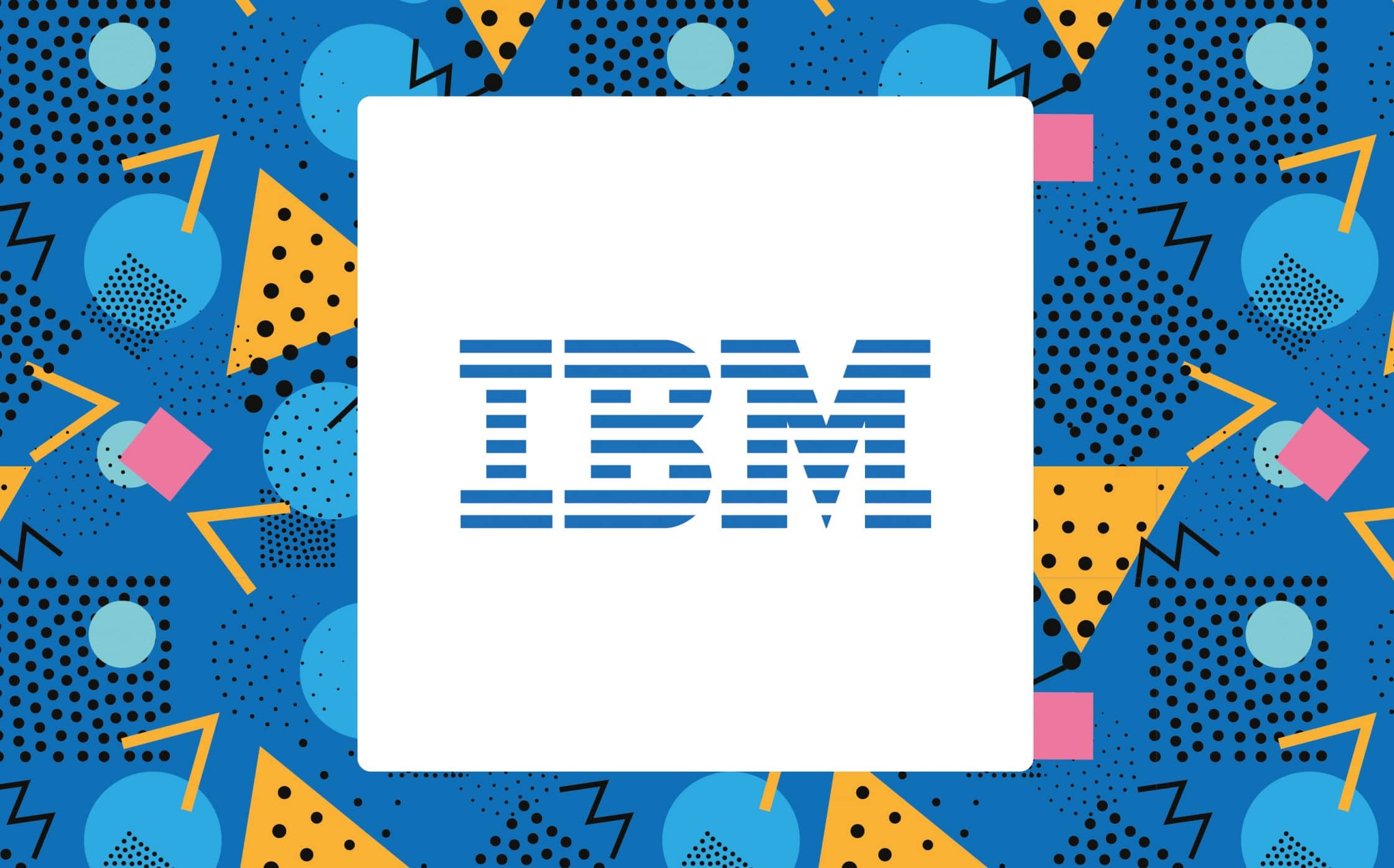
There’s already plenty of research out there that outlines how influential logos can be when it comes to capturing the attention of your audience. One study in 2011 found that when a company uses an “incomplete” logo, like IBM, people consider the business to be more inventive, but less trustworthy.
Even a basic understanding of the psychology of logo shapes in graphic design is enough to show us how important different patterns can be to customer perception. Something as simple as using a circle, instead of a square, could be enough to change the way that your target audience thinks and feels about your brand.
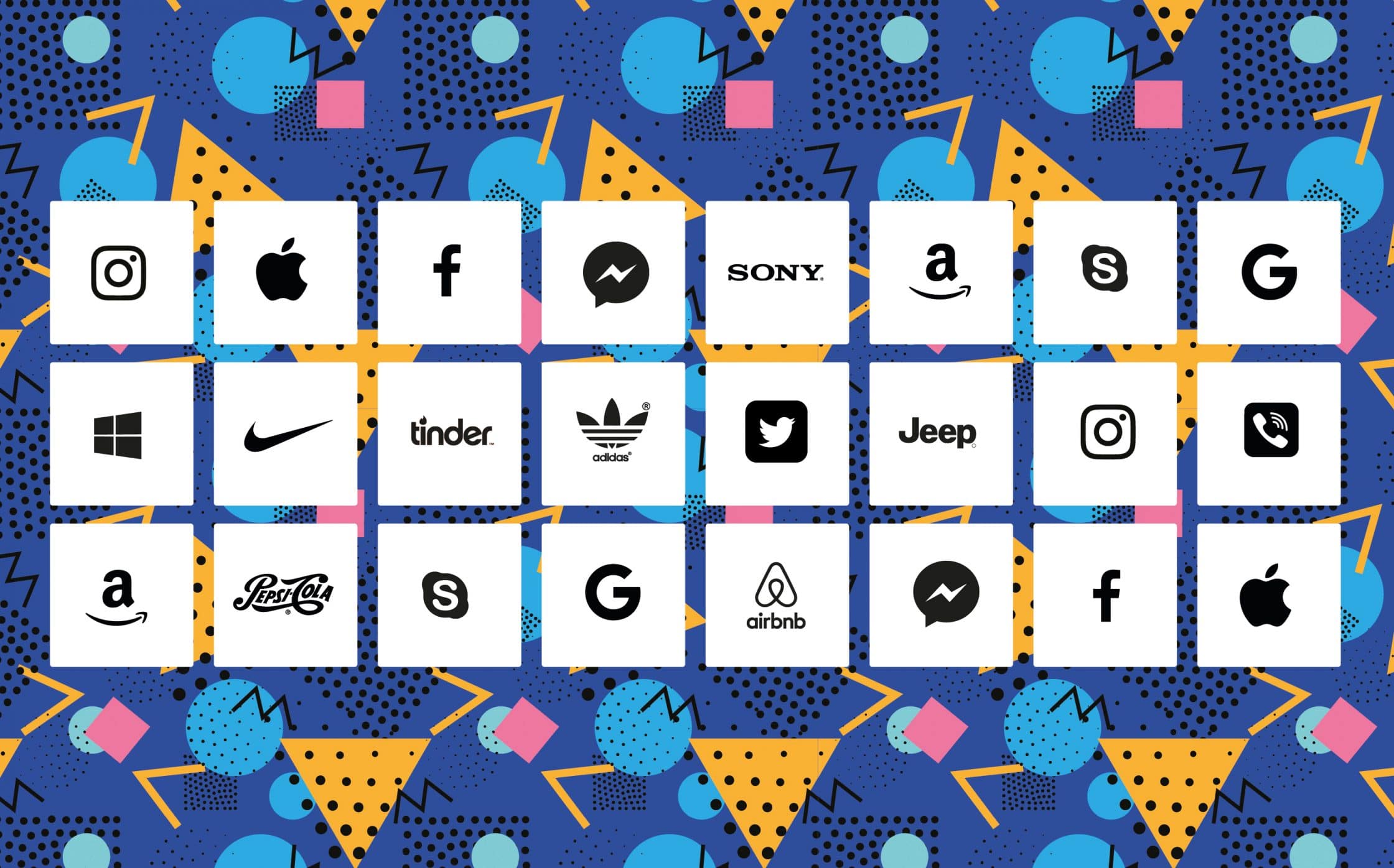
The simple reason why logo shapes are so crucial is that the human brain is hard-wired to memorise, and assign meaning to them. In fact, the way that we process shape is a fundamental aspect of how humans learn things. A distinctive shape remains stored within the banks of your memory long after you’ve seen it. Just think about that iconic Nike swoosh or the Twitter bird.
However, there’s more to making the most of shape in logo design than making sure your customers can remember and recognise your brand. The shapes that you choose also need to convey the correct messages to your audience. For instance, vertical lines, circles, squares, and triangles all communicate different meanings that skilled logo designers can take advantage of.
With the right branding experts on hand, you can use your logo shapes to:
- Symbolise different ideas.
- Direct the eye from one element to the next.
- Convey emotion and mood.
- Create trust and professionalism.
- Deliver a sense of depth.
- Connect with your audience on a deeper level.
So, what exactly can we learn about the psychology of logo shapes, and how will each geometrical element used in your logo impact the way that your customers feel about you?
The psychology of logo shapes: Circles
Circles are a pretty common feature in logo design. In fact, they’re used in 20% of the world’s most admired brands. When you use circles in your logo shapes, you convey:
- Positive emotional messages: Circles seem softer and more welcoming than harshly-angled shapes like triangles and squares
- Unity and commitment: Rings are often connected with the idea of marriage, so they seem to communicate an important bond when used in logo design.
- Strength and steadiness: Circles are consistent and sturdy — they don’t have any breaks or turns. This can make your business appear more reliable.
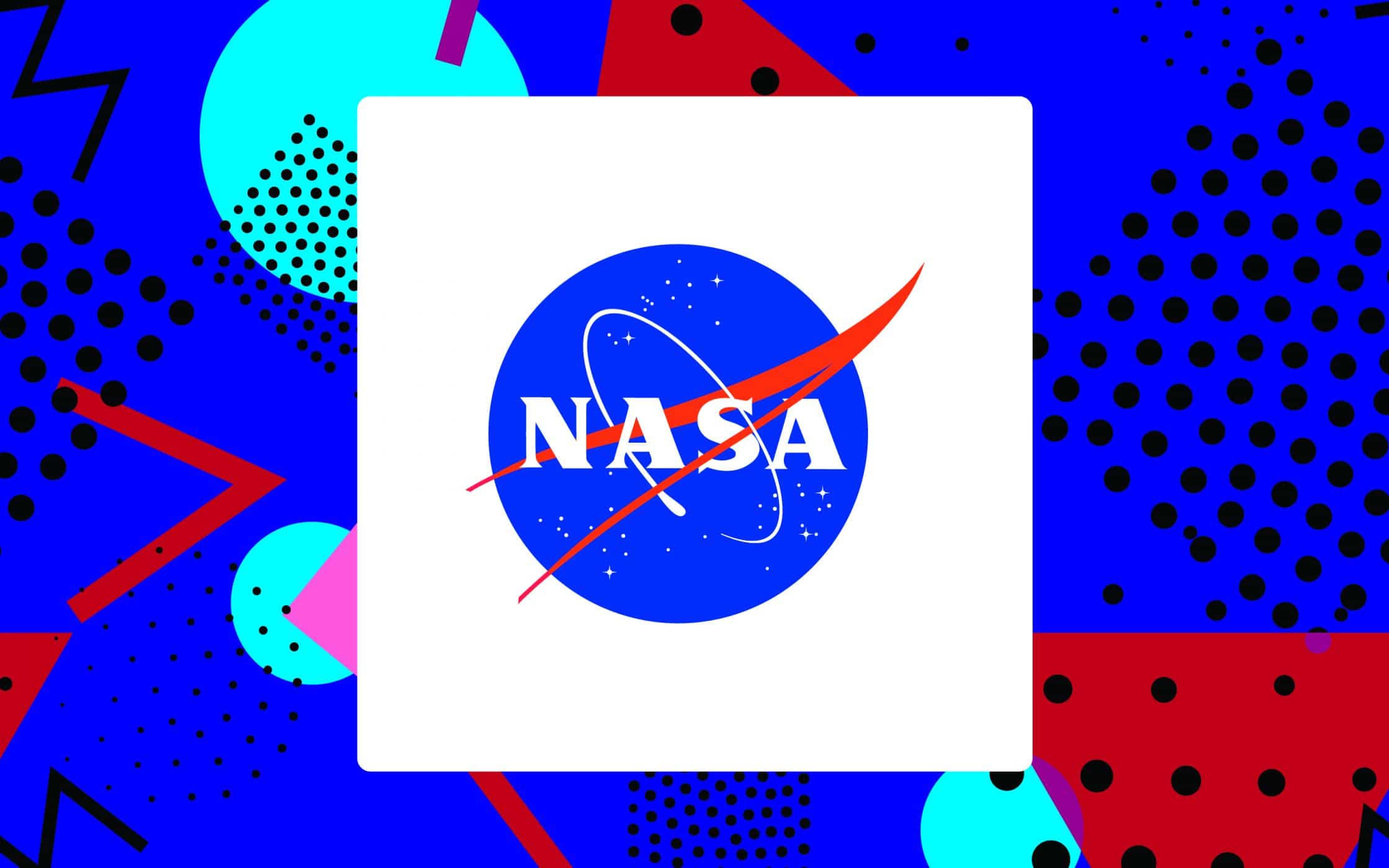
Many of the most iconic brands in the world use circles in their logo shapes. For instance, the NASA design displays a sphere that represents stability, commitment, and of course, the unity of an entire planet devoted to space exploration.
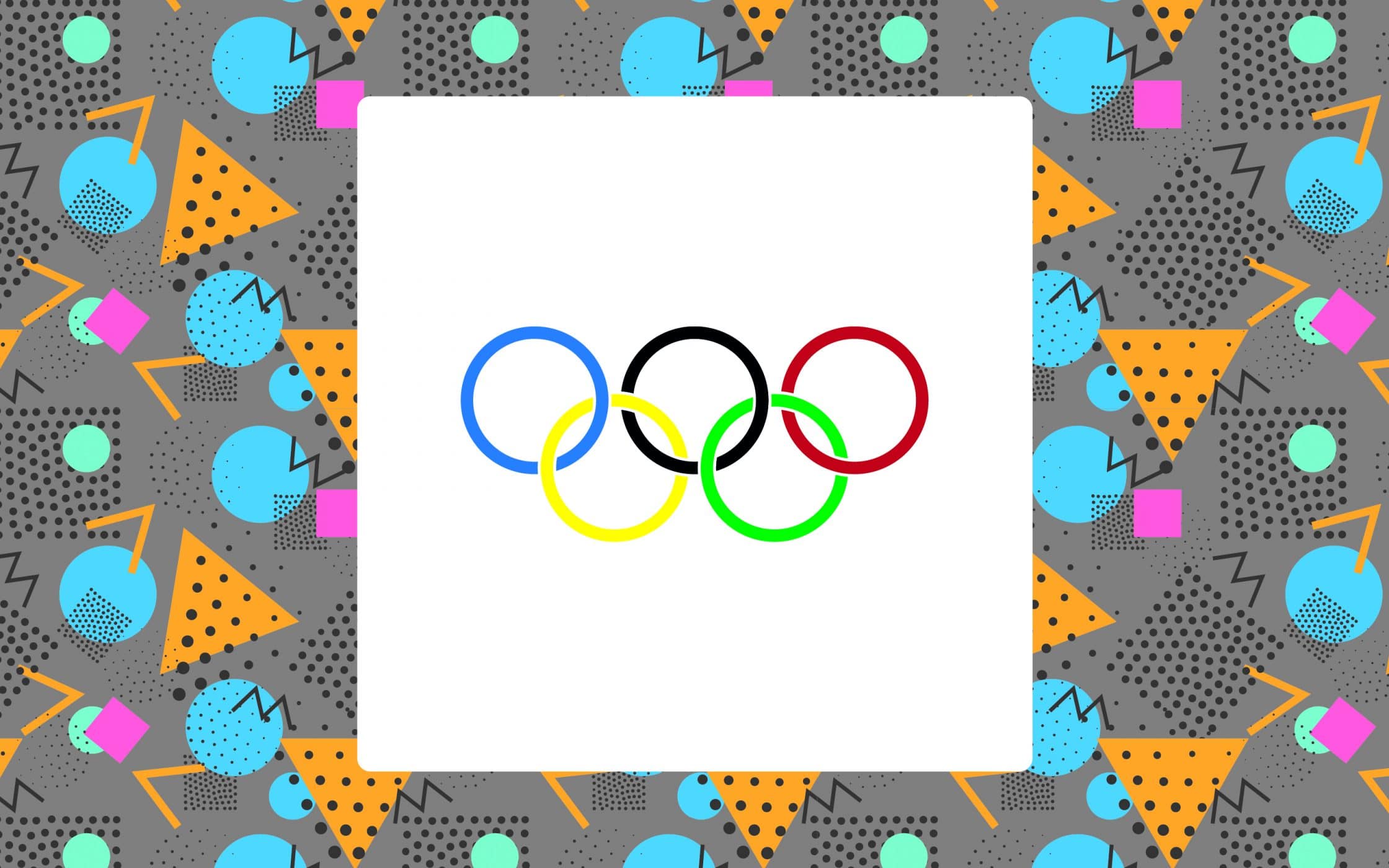
In the psychology of logo shapes, circular designs are often used to portray a “feminine” essence. Ovals, circles, rings, and ellipses can all project positive, comforting, and united energies. As an example, the Olympic rings are used to demonstrate the inclusive nature of the worldwide sporting event. They highlight that people from any background or nation can take part in this universal celebration of human accomplishment.
If you want a simple, yet effective logo shape that seems to indicate strength and community above all else, then a circle could be perfect for you. Remember, you can also use “circular” or curved movement in your logo to create a more flowing design through typography. This technique is evident in the Coca-Cola logo and font.
The flowing, creative elements of the image seem to denote warmth, movement, and community – which Coca-Cola has embraced as part of its brand identity. Just think about all the “Share a Coke” campaigns, and advertising strategies that push positive, unified ideas.
The psychology of logo shapes: Squares
As another inherently popular logo design shape, squares are used to depict ideas of proportion, balance, and professionalism. A square or even a rectangle can be enough to inspire trust in an audience searching for strength and safety. After all, some of the most “secure” things in the world are rectangular or square in shape, such as a safe, a house, or a vault.
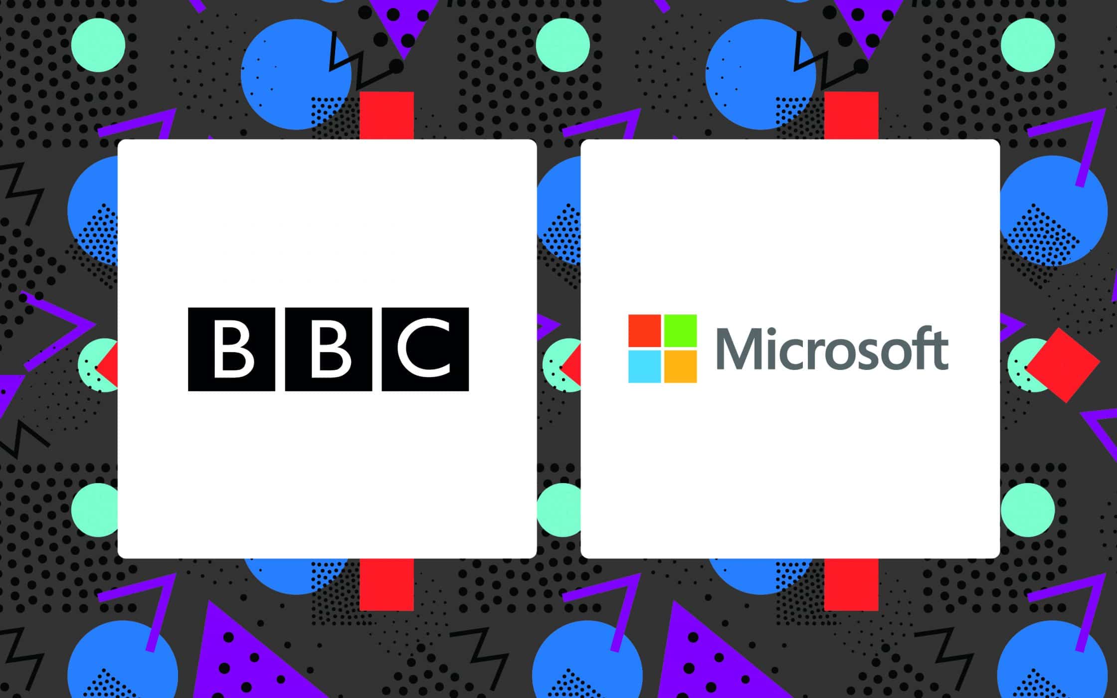
Some brands have turned to squares as a way of telling their brand story to their customers in an instant. For instance, the Microsoft logo is made up of four differently coloured squares that indicate the trademark “Windows” software, alongside a range of diverse products, each represented by a new colour. On the other hand, the YouTube slightly rounded rectangle design looks like an old-fashioned TV screen.
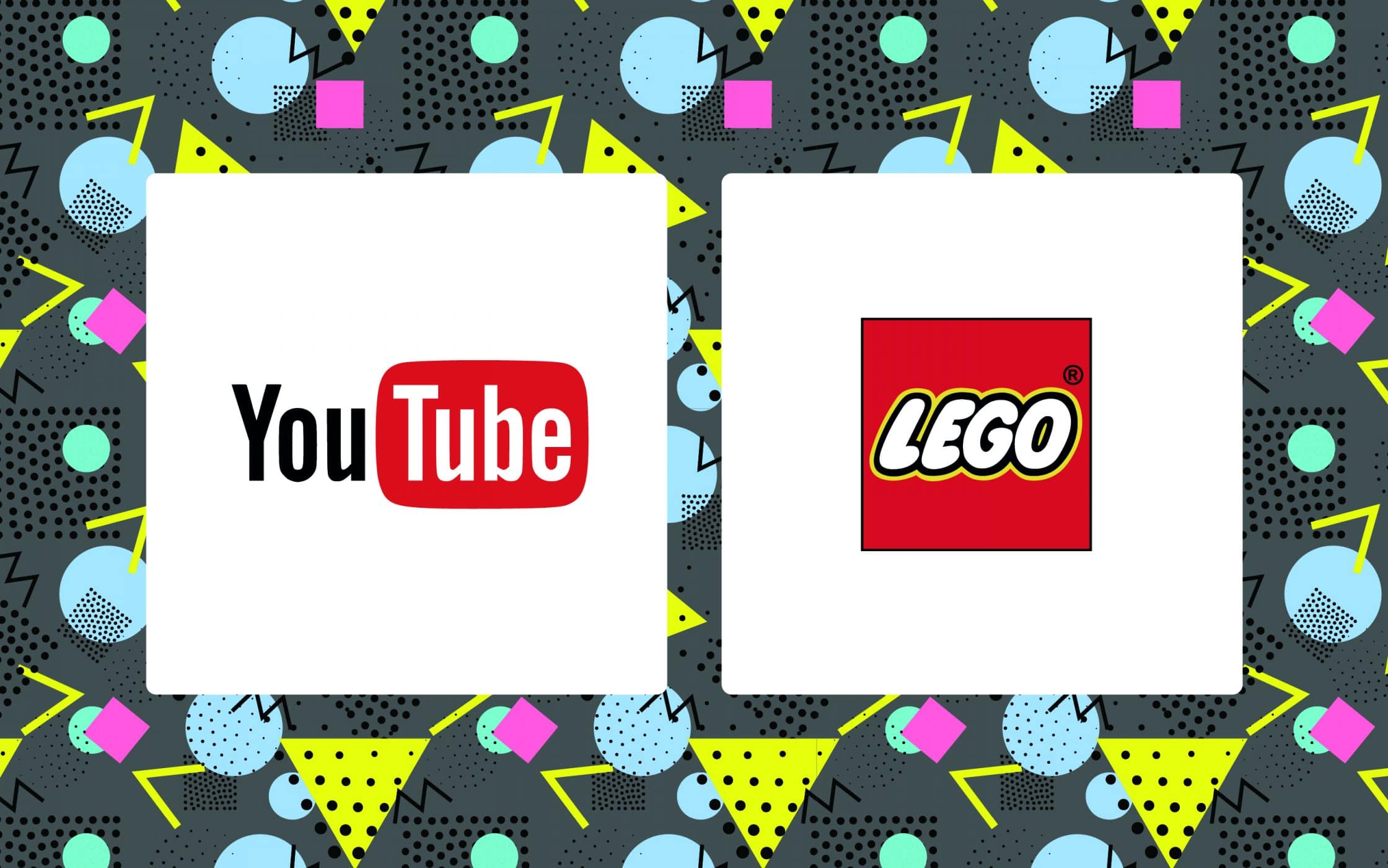
Squares and rectangles are a useful way for brands to tell their story in a safe and secure way. The Lego logo, for instance, uses the brick design to point to the signature building blocks produced by the brand itself, while the square itself indicates a sense of safety. Since parents are looking to toy companies to provide them with a combination of fun and security, Lego has embraced the perfect company shape.
On the other hand, the use of squares in logo design can also develop a sense of power and strength. Combine those harsh elements with rounded contours and fonts, and you can convey an idea of stability, balance, and reliability. The BBC logo is intended to convey a sense of confidence within the brand. The powerful shape is solid and strong.
However, the “basic” nature of the square as a logo shape means that it does run the risk of becoming outdated or boring. This is why it’s often a good idea to use colour and shape psychology at the same time. Consider the Microsoft logo compared to the BBC logo. While both make use of squares, the Microsoft logo uses a variety of colours to engage its audience, and convey the diversity of the brand.
The psychology of logo shapes: Triangles
Triangles are a much less popular shape in logo design – but that doesn’t make them any less appealing in the right circumstances. When used for your logo shapes, triangles can inspire many different ideas, including dynamic power, a sense of hierarchy, and continuous motion or improvement.
Triangles have energy because they’re pushing in a certain direction. They might not induce feelings of security and comfort like rectangles or squares, but they could do wonders for showing the innovation behind your brand.
Triangular logo shapes can be tricky to work with, as most businesses are concerned with making their customers feel as safe as possible. However, many brands have been able to use triangle shapes effectively to boost brand awareness and make their image more unique. By way of example, the Delta airlines triangle indicates speed and movement.
Generally, if you’re going to use a triangle to indicate direction or motion in your brand logo, then you need to make sure that the angles are pointing upwards, or to the right. A triangle that points downwards or left in Western cultures instantly channels negative thoughts.
Masculine, powerful, and brimming with strong edges, the triangle logo shape is more commonly used in the construction, motor, legal, and scientific industries. For instance, Mitsubishi Motors and CAT construction all have iconic triangular logos.
Of course, remember that you don’t necessarily need to use a triangle as a “direct” aspect of logo design to take advantage of the shape. You can also implement triangles into your marketing mix in a subtler way too. Consider FedEx’s award-winning design as an example. The letters “E” and “X” come together in an innovative way to form an arrow.
This clever use of negative space subliminally makes customers think about FedEx’s speed and reliability as a courier service.
The psychology of logo shapes: Lines
Circles, squares, rectangles, and triangles may be the most obvious elements to think about when you’re exploring the psychology of logo shapes. However, it’s important to remember that there’s another shape out there that many companies overlook: the line or linear design.
The formation of the lines in your logo shapes can be enough to impact the perception of your audience. Vertical lines create a subconscious association with strength and sophistication, while causing logos to appear slimmer. On the other hand, horizontal lines create a sense of tranquility and calm. The type of line you choose will depend on your brand personality.
Vertical lines are powerful and engaging. They draw the eye of the viewer downwards, often directing the eye towards the brand name. They convey professionalism, like squares and rectangles, while also expressing an idea of motion. A good example is the SoundCloud logo, which uses its vertical lines to represent “sound”, while giving depth to the overall logo design. By combining harsh vertical lines and the curves of a cloud, SoundCloud can portray strength, and creativity at once.
Contrastingly, horizontal lines indicate a sense of tranquility, reliability, and calm. They’re dramatically different from vertical lines when used in logo design, and can help to make your customers feel protected, and settled. For instance, a great example is the IBM logo, which we referenced above.
Not only do the horizontal lines help to calm the senses, but the use of the colour blue contributes to the overall effect of trustworthiness and reliability. The comforting colour, combined with the level-headed feel that horizontal lines produce, means that the psychology of logo shapes works to make the brand appear safer.
The psychology of logo shapes: Organic shapes & spirals
Finally, some of the most unique logo shapes are those that use spirals, and organic icons, rather than basic frames such as a circle, square, or triangle. In some cases, a spiral can be considered a kind of circle, but it generally has a very different impact on an audience.
Though they’re less common in the world of logo design, spirals can be hypnotising or centralising in the right conditions – perfect for when you want to engage your audience. Spirals are often found in the natural growth patterns of many things, and they can express ideas of expansion, birth, fertility, and transformation. Spirals can also be used in the medical industry to symbolise DNA:
On the other hand, organic shapes are used to refer to the naturally occurring shapes of nature. In that way, you could argue that spirals themselves are an “organic” shape. Organic elements in logo design are intended to create a sense of warmth and comfort that can’t be portrayed by a geometrically perfect circle or square.
Obviously, the key to using organic shapes is making sure that you pick something that resonates properly with your brand. In the examples above, Gatorade uses a lightning bolt to symbolise how they can energise their customers. On the other hand, the leaf on Tropicana shows the “natural” focus of the company and gives depth to their brand purpose.
7 Ways to use shape psychology in your logo design
So, now you know the basics around the psychology of logo shapes. The next step is figuring out how you can use these concepts yourself.
Before you even begin working with a logo design company, it’s important to think carefully about the values and attributes that you want your logo to convey. You can go through this process with your branding experts if it makes it easier, as they will be able to help you get to know your user personas and design an image that corresponds to their expectations.
Once you have an idea of the message that you need to portray through your logo, you’ll be able to start thinking about how you can tell a story through everything from typefaces, to colours, and of course, shapes too.
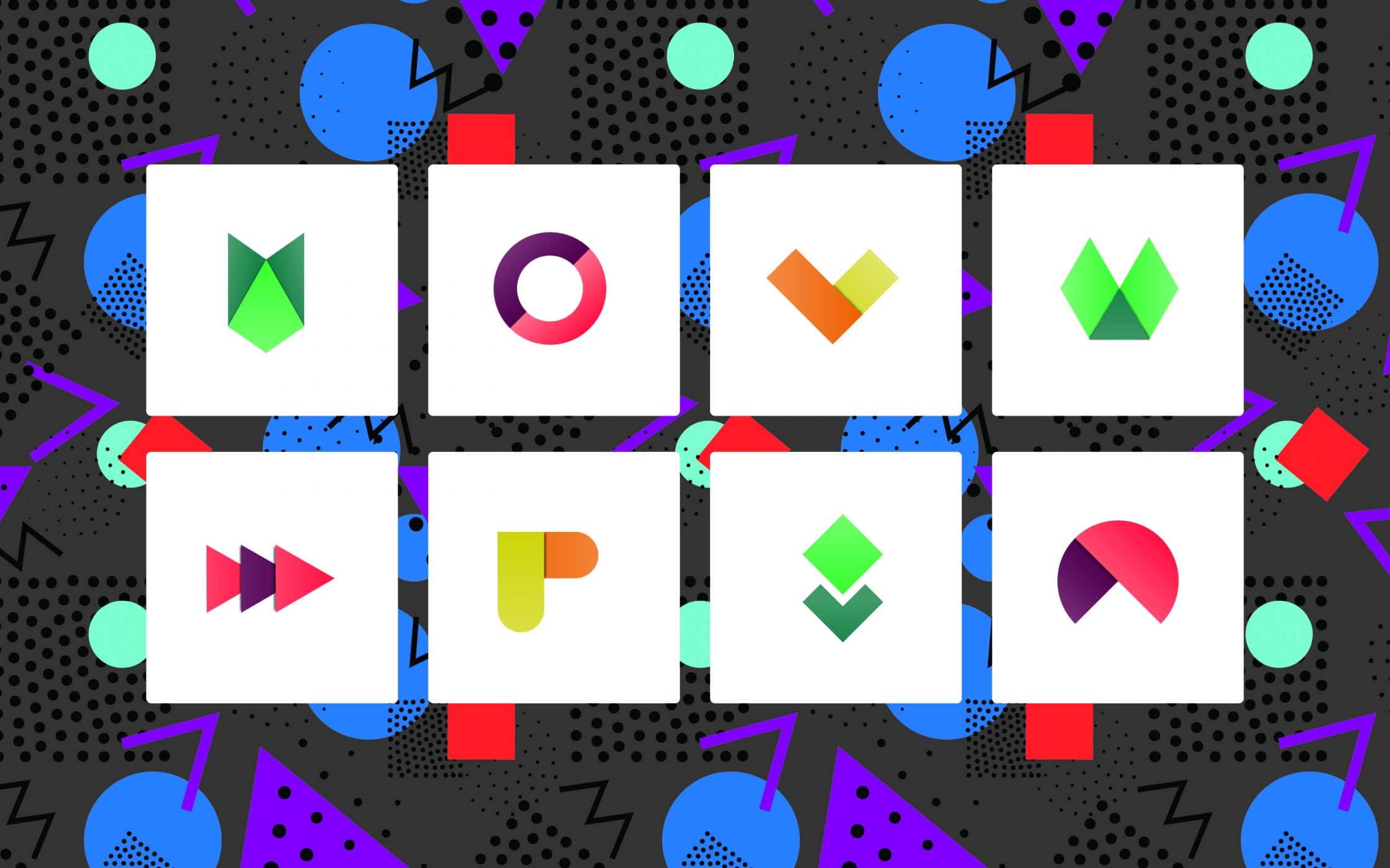
Here are a few things to keep in mind:
1. Choose shapes that “feel” right
As we addressed in the sections above, shapes can have a huge impact on emotion. While squares can make a customer feel secure, circles are more comforting. Since emotion has a huge impact on the success of your marketing campaigns, it’s important to choose the right shapes, to elicit the right feelings:
- Triangles suggest excitement and growth: A company that specialises in travel, or one that’s known for innovation could benefit from a triangle-based logo.
- Circles indicate love, comfort, and inclusion: If you want to send a message of unity and compassion, then you could benefit from the emotional connections circles create.
- Squares convey strength, courage, and discipline: Though squares can sometimes be a little boring, they’re also perfect for industries where you need to create customer loyalty.
2. Know how to combine shape and colour
The psychology of logo shapes often goes far beyond the obvious issues, like ensuring that your shapes are ready to indicate the right emotions. You’ll also need to ensure that you’re using the right colours with certain shapes to give extra weight to the idea or image you’re portraying. For example, bright colours like yellow can naturally complement the angular sharpness of a triangle.
On the other hand, red partners well with squares, and spiritual blue colours work best with circles. Changing the way, you think about colour psychology in relation to shape psychology can help your company to indicate numerous ideas at once.
3. Choose a shape relevant to your industry
Some logo shapes naturally work best when used to highlight specific industries. For instance, companies that are service-oriented, such as those in the realm of education, childcare, or charity, might use circles because they represent warmth and inclusion.
Alternatively, companies in insurance, finance, and other conservative industries where trust is key are more likely to stick with rectangles and squares. That’s because these businesses need their customers to be able to trust them to deliver a certain level of reliable service. Selecting squares and rectangles can reassure potential clients.
4. Remember the shapes that appear in negative space
If you want to use your logo design to create affinity with your audience, then you need to take every detail into consideration. This means evaluating not just what the obvious shapes in your logo communicate, but what the hidden shapes in the negative space are saying too.
As mentioned above, FedEx is a frequently-cited example of how negative space can be used cleverly to demonstrate certain ideas. Used properly, negative space can help to pack additional meaning into your logo design without making your brand mark seem too cluttered or overly complicated.
5. Keep typography in mind
Speaking of the subtle shapes in logo design, remember that the font or typography you choose will have its own shapes too. For instance, you could choose letters that have soft, comforting curves, or harsh, more professional lines.
Think carefully about what your chosen typeface suggests about your business. For instance, diagonal angular typefaces can come across as loud and aggressive, but they can also reveal dynamism. On the other hand, softer, rounded letters are frequently used by companies who want to give a fresh and fun essence to their business.
6. Combine the right shapes
Today, many brands are looking for ways to differentiate themselves from their competitors with their use of logo design. This could mean using multiple shapes at once, rather than just a single idea. However, it’s important not to clutter your logo with too many opposing ideas.
Mixing and matching different combinations of logo shapes, typographies, colours, and images can help you to create an endless variety of visual messages. Just make sure that the finishing image you create is something that can effectively represent the core values of your company, and what you hope to achieve as a brand.
7. Stay simple
Last, but not least, one of the most important “golden rules” in logo design will always be to “keep it simple”. Although there’s nothing wrong with being creative and trying out some new ideas, if you overwork the execution, or try to fit too many ideas into a single logo, then you’re going to end up with problems.
A great way to test the simplicity of the logo design you create is to subtract elements until you believe you’re sending the same message with the most basic image possible. Be as brutal as you can, and think about the most unique, defining features that you need to demonstrate.
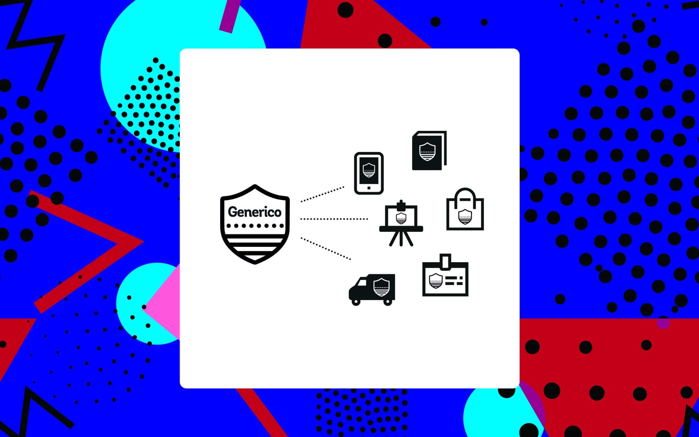
Don’t get bent out of shape over logo design
Creating the ideal logo is no simple feat – that’s why there are entire companies devoted to helping you design the image that’s most beneficial to your brand.
When you work with one of these professional groups, you’ll often begin to think more carefully about all the different, and inter-communicating elements within a logo design that help to make your brand more recognisable, and memorable – from colours, to shapes.
The shapes you incorporate into your design will quickly become an intrinsic element of the message that you convey to company customers and the public overall. Once you understand the psychology behind shapes, you’ll be able to use your knowledge of customer behaviour to create a more powerful brand.
Just remember, the advice given above is intended for use by Western audiences. Different shapes can mean different things to diverse cultures around the world. That means that you and your brand professionals will need to carefully research your target market to ensure that certain ideas will still work.
It’s time to get your brand in shape!
If you enjoyed this article, you might enjoy these too:
— How to create a brand identity with impact
— Why you need clearly defined brand values


